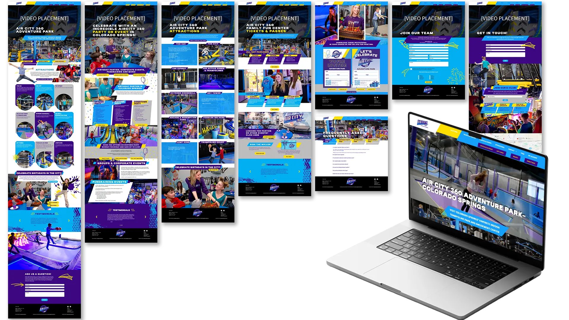
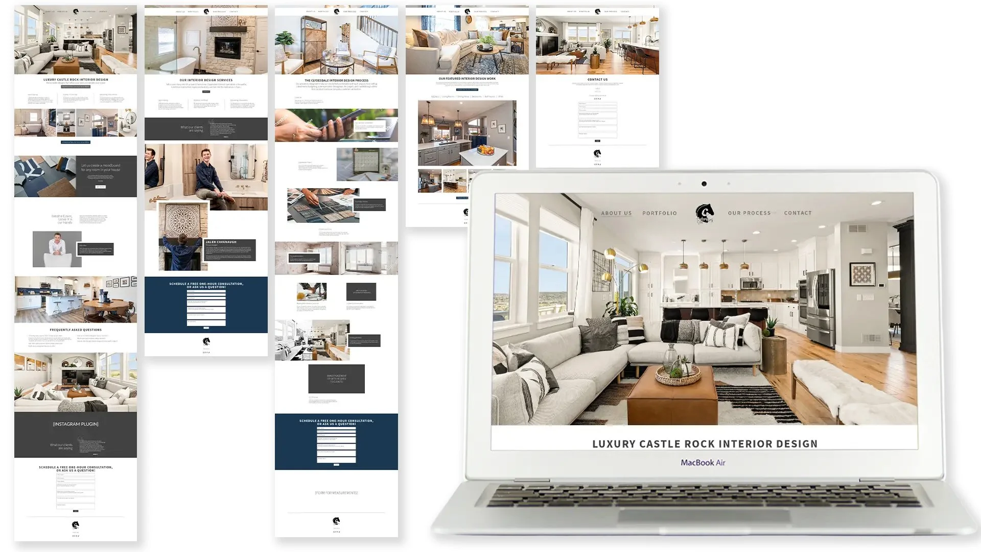
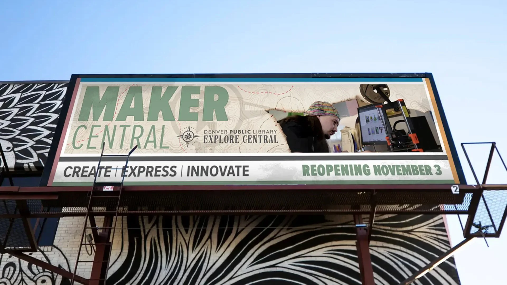
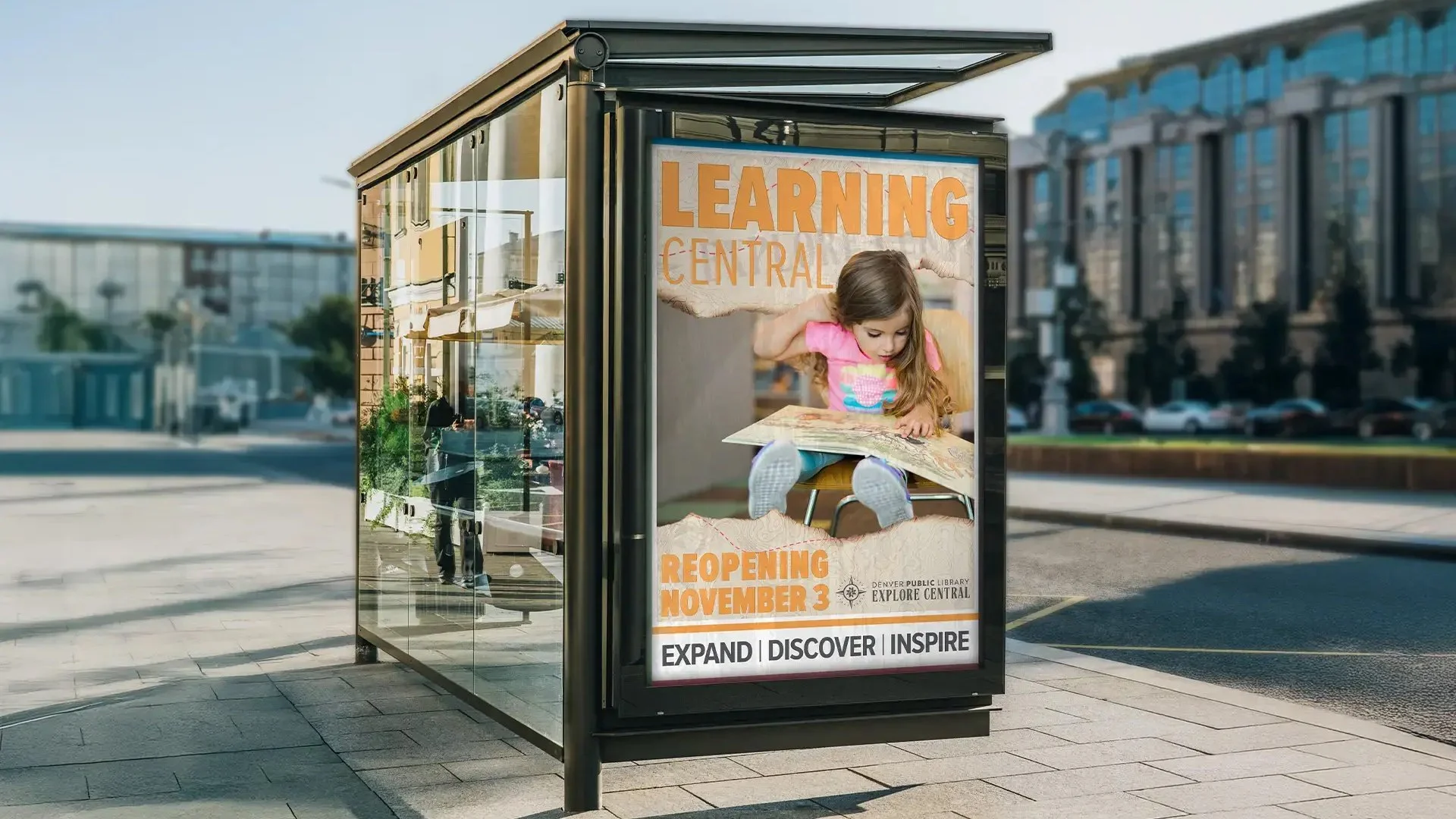
At Beholde, I worked at the intersection of design, marketing strategy, and execution—bringing brands to life across both physical and digital touchpoints. My work ranged from large-scale applications like car wraps to detailed stationery systems and responsive web design, always ensuring every piece felt cohesive, intentional, and true to the client’s identity. I collaborated closely with strategists, marketers, and clients to translate vision into visuals that were not only compelling, but practical and aligned with business goals.
What defined my time at Beholde was consistency and care. Every design decision was grounded in brand guidelines, audience insight, and the broader marketing strategy, whether I was developing campaign assets, refining brand systems, or supporting ongoing client needs. I focused on maintaining visual integrity across channels while adapting designs to perform in real-world contexts—helping clients show up clearly, confidently, and cohesively wherever their brand lived.
Aims to cultivate a vibrant community centered around exceptionally flavorful and delightfully surprising plant-based cuisine (I've personally sampled numerous recipes). The venture hosts monthly pop-up dinners and is embarking on the journey of crafting its own line of vegan cheeses for sale at local farm markets. The logo draws inspiration from a font designed to evoke the fluidity and dynamism of liquids. Additionally, certain letters are interconnected, symbolizing the blossoming connection between the chef, nourishing fare, and cherished patrons.
You can contact her here.
PROJECT
Brand Identity
Packaging
Labels
One of the aspects I cherish most about traveling is the opportunity to forge connections with new individuals, while immersing myself in their cultures, beliefs, traditions, perspectives, culinary delights, melodies, landscapes—essentially, every facet of their world. During a recent journey, I had the pleasure of crossing paths with the co-founder of Aracanto. Much like myself, she is from Colombia and is profoundly dedicated to showcasing the country's abundant offerings in coffee, cuisine, music, dance, landscapes, scenery, and its people's warmth. Her commitment materialized in the form of a tour agency specializing in meticulously organized Colombian excursions.
Given our shared background, we naturally bonded, ultimately collaborating on the agency's branding. The name 'Aracanto' ingeniously marries two Spanish words—'arar,' symbolizing cultivation and plowing, emblematic of coffee country, and 'canto,' representing song, a nod to Colombia's myriad vibrant avian species, notably the toucan.
The color palette was thoughtfully chosen to encapsulate the tranquil turquoise of the beaches, evoking a sense of serenity, rejuvenation, and tranquility.
I highly recommend you visit Colombia and book a tour with Aracanto here.
PROJECT
Brand Identity
Stationery
I had the pleasure of crossing paths with a truly remarkable woman through the serendipities of life. A masterful massage therapist and skilled waxologist, she effortlessly juggles these roles alongside her cherished role as a devoted mother to two lovely children, a son named Pablo and a daughter named Mia. Instead of confining her talents to a single spa or salon, she takes a personalized approach, curating an exceptional experience for her clients by offering her services in the comfort of their own homes. Picture this: she arrives armed with her complete waxing kit, an assortment of soothing essential oils, aromatic candles, and her massage bed—all the essentials for a blissful session.
To ensure a seamless waxing experience suitable for all skin types and to prevent any discomfort or ingrown hairs, she employs a unique honey wax formula infused with carefully selected ingredients. Given her affinity for honey as a primary ingredient, the logo prominently features a bee crafted using hexagonal elements, a direct homage to the honeycomb structure. The color palette she's chosen draws inspiration from the natural world—lush flora, a touch of honey's sweetness, and an overall grounding sensation.
PROJECT
Brand Identity
Stationery
Social Media
Yuri, an impassioned advocate for personal development, wears the hats of both a dedicated single mother and a devoted guide on the journey to enhanced well-being. Her true purpose lies in empowering others to embrace healthier, more joyful lives while fostering a deeper connection with their own sexuality and lifestyle.
In shaping her brand, Yuri sought a representation that encapsulates life's vitality, the strength of unity, and the harmonious coexistence of both feminine and masculine energies. To fulfill this vision, an extensive exploration of diverse cultural symbols—ranging from hieroglyphs and nahuals to Wicca and pictographs—was undertaken. The culmination of this study resulted in the creation of a singular icon that beautifully encapsulates these multifaceted concepts.
The carefully chosen color palette mirrors the very aspirations of her clients: tranquility, physical and mental well-being, and unbridled happiness. Each hue resonates with the ultimate goals of her practice, radiating a sense of calm and positivity.
If you want to learn more about her services, click here.
PROJECT
Branding
Stationery
Social Media
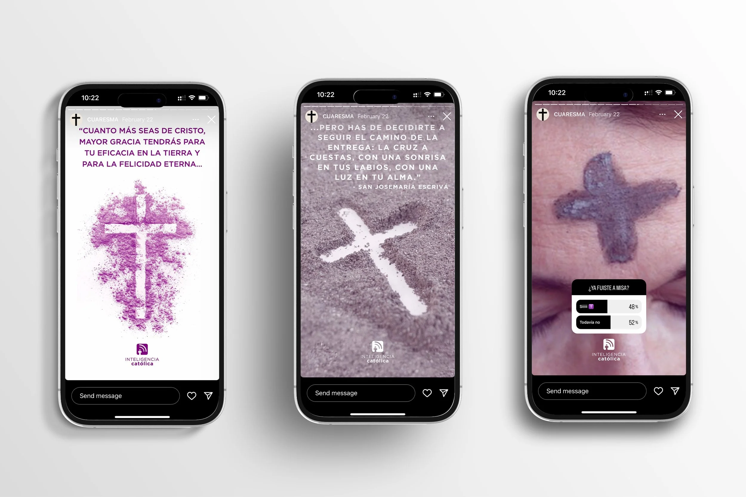
For quite some time now, I've harbored a profound desire to assist others in achieving success, whatever that might mean to them, nurturing self-love and compassion, and sparking inspiration for kindness. Inteligencia Católica (Catholic Intelligence in English), a dynamic movement spearheaded by a collective of Catholics who are dedicated to fostering faith, hope, and love. Driven by a profound sense of compassion, this movement shines a light on the lives that are in need of illumination, cultivating a community that embraces diversity and nurtures a profound sense of belonging. Together, we embrace the audacity to dream, have faith, and uplift others, all while uncovering the very essence of our shared humanity.
I met a few of the team members a few years back, during a retreat I attended to establish a connection with a higher power (referred to as God by some, and as the Universe by me). Despite not identifying as Catholic (leaning more towards a spiritual outlook), I was captivated by the idea of joining this remarkable team and contributing as a volunteer (akin to the rest of the team) by crafting visual content for social media. Our unity stems from a shared objective: the widespread dissemination of love, hope, and belief.
PROJECT
Community Management
Content Creator
Ah, Guatemala—an enchanting nation blessed by both the Pacific and Atlantic shores. Allow me to introduce a devoted enterprise committed to curating exceptional fishing expeditions along the Pacific Ocean's vibrant Guatemalan coastline. With a keen focus on crafting memorable fishing experiences, this company ensures that the thrill of that first catch is celebrated by conjuring up a fresh batch of ceviche—a fitting reward for the crew.
Beyond fishing, they extend a diverse array of offerings, from captivating whale-watching excursions to leisurely horseback rides along the sandy beaches, topped off with moments of pure relaxation within the embrace of a hammock.
Drawing inspiration from the vast expanse of the sea, this company's logo elegantly incorporates navigational elements—such as the compass and helm—as pivotal symbols. The helm, aligning with the compass's guidance, becomes an emblem of the journey's direction amidst the waves.
PROJECT
Brand Identity
Stationery
Website
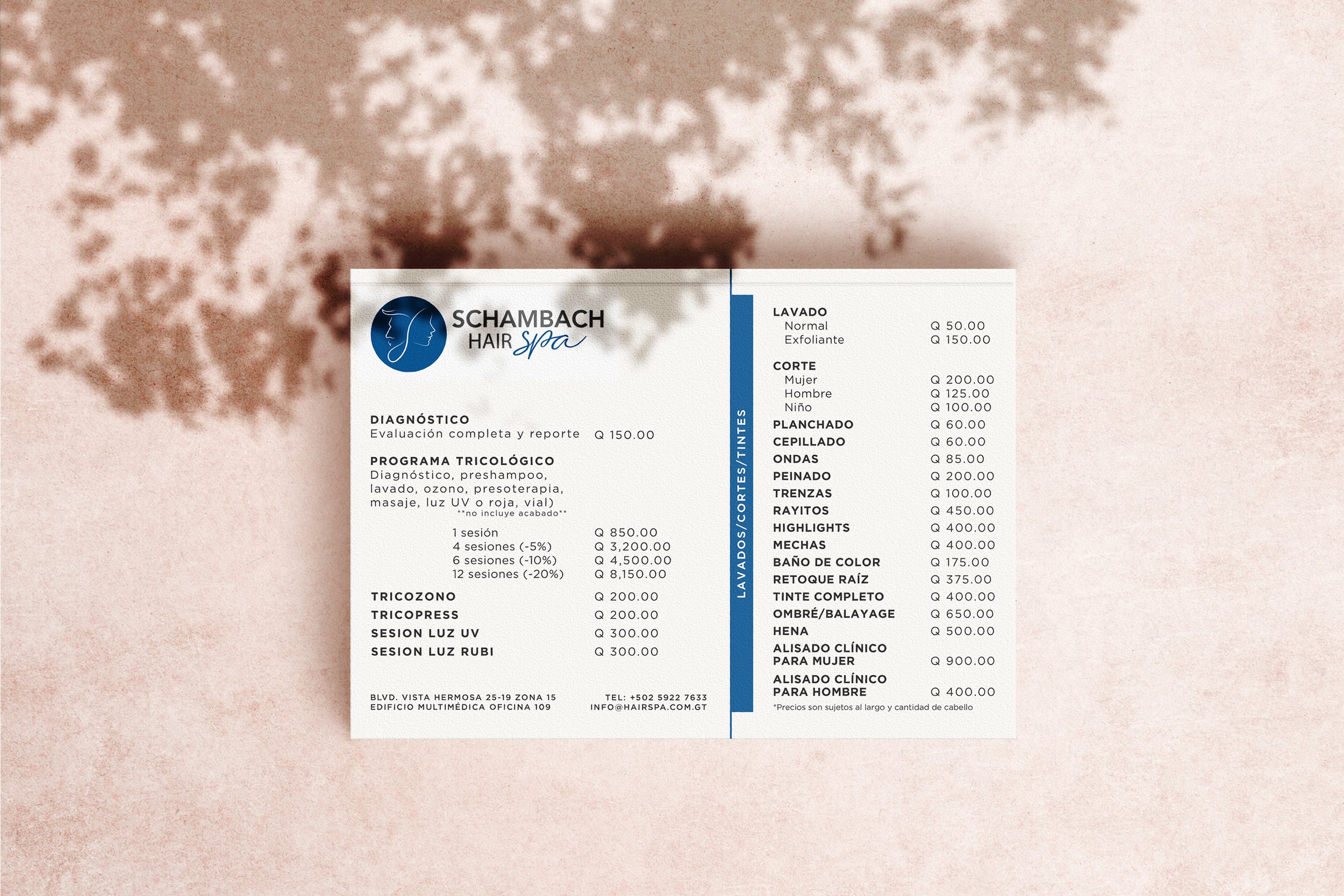
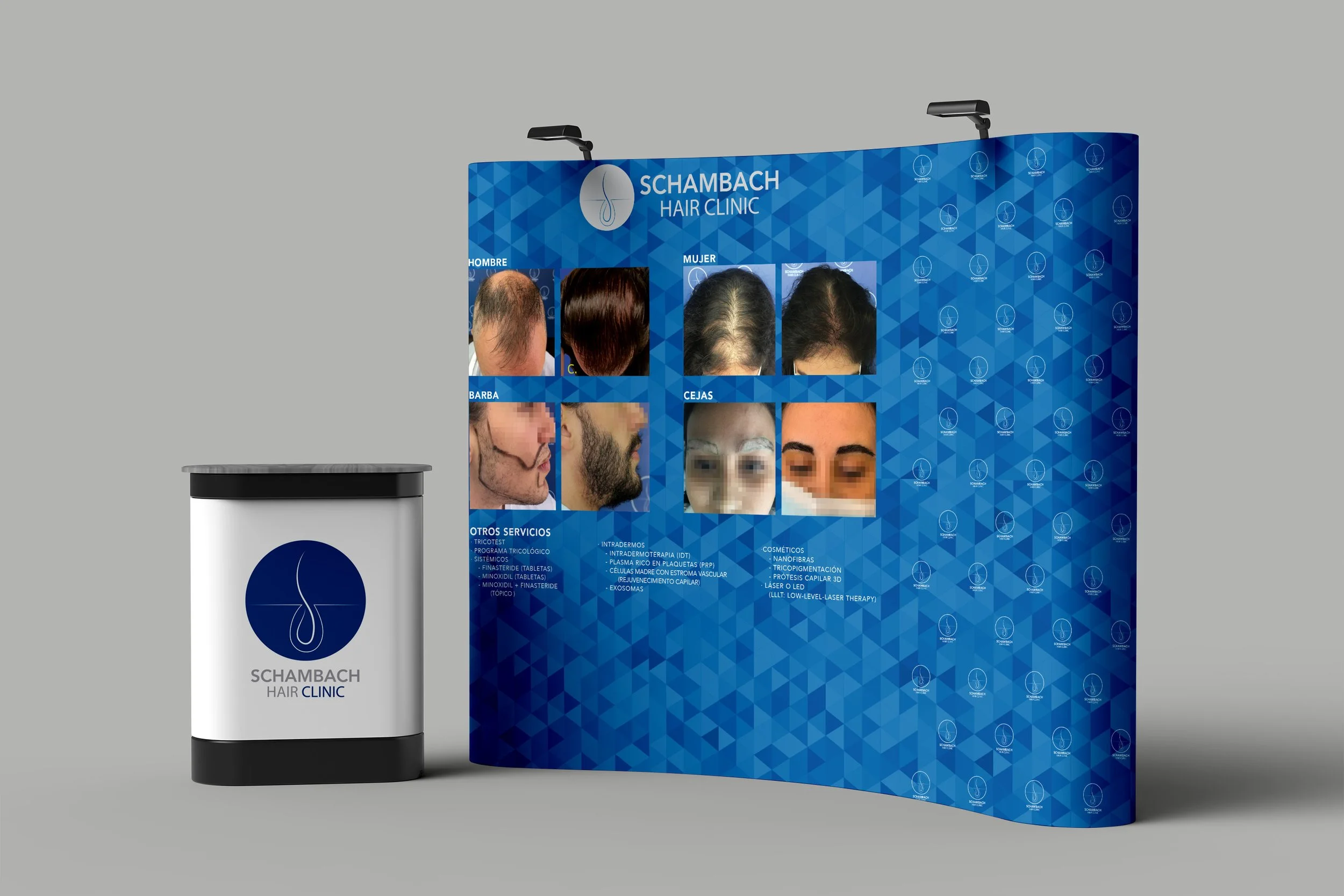
Step into the world of Schambach Hair Clinic, where a multitude of patrons yearned for more than just standard hair services—haircuts, color treatments, and trichotests (a specialized scalp health assessment), among others. Responding to this demand, the clinic expanded its horizons to establish a dedicated hair salon. Here, a comprehensive range of clinical products and treatments are meticulously curated to not only enhance hair's aesthetics, but also to nurture and maintain the scalp's overall well-being.
Every aspect of the hair salon, from haircuts to dyes and hairstyles, is imbued with clinical precision, employing advanced techniques and specialized products. The inspiration for the logo takes root in Schambach Hair Clinic's distinctive emblem, featuring the iconic follicle or hair graft. This emblem gracefully weaves together the silhouettes of both a woman and a man, symbolizing inclusivity and underscoring that the services of the hair spa cater to all. Moreover, the follicle icon serves as a subtle guardian of privacy, reflecting the sanctuary that all patients and clients find within the salon's walls.
You can contact the hair spa here.
PROJECT
Branding
Corporate branding
Web design
Social media
Community Manager
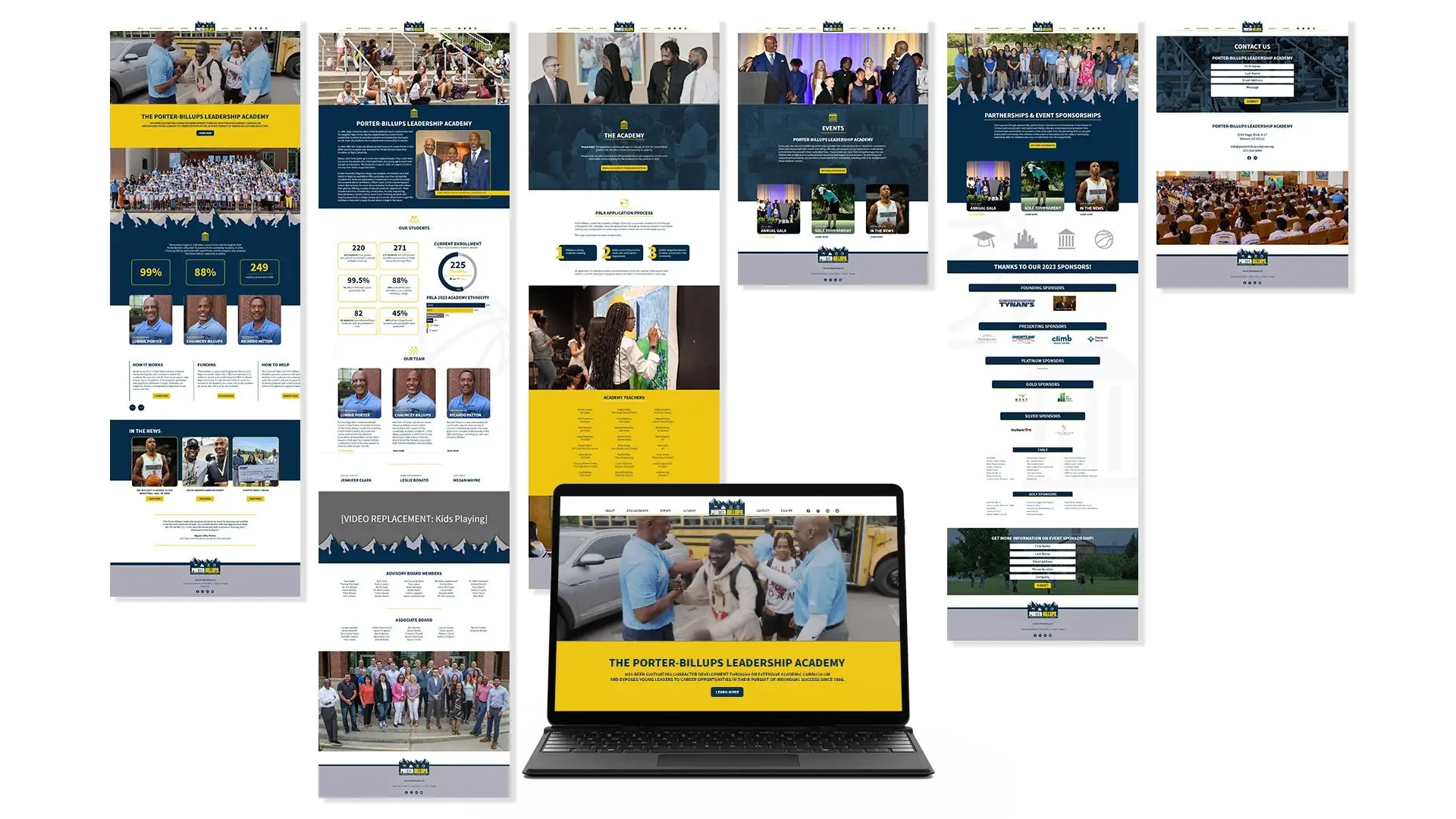
Dr. Schambach stands as a prominent figure within the global medical community, celebrated for her expertise. Her insights have secured her a recurring role as a featured speaker at numerous international congresses. Despite the existence of a pre-existing clinic logo, Dr. Schambach proactively sought out assistance to elevate her clinic's online presence. The objective? To infuse her clinic's social media platforms with an aesthetic appeal that resonates and engages a broader audience, all while naturally expanding reach.
Moreover, recognizing the evolving needs of her patients, both current and prospective, Dr. Schambach embarked on the journey to enhance her clinic's online interface. The aim is to render the website user-friendly, catering to individuals of all ages. This deliberate redesign serves a greater purpose: fostering awareness about hair restoration health and imparting knowledge about the significance of scalp and hair care. Through this visual transformation, Dr. Schambach aspires to impart a wider understanding of hair wellness to individuals from all walks of life.
If you’re interested in know more about her, click here.
PROJECT
Corporate branding
Stationery
Website design
Brochure
Editorial
Content creator
ProCapeli, a distinguished hair restoration clinic nestled in Guatemala, shares its geographical origins with the esteemed Schambach Hair Clinic. While both establishments provide akin services, techniques, and product offerings, they astutely cater to distinct communities.
Informed by the intricate interplay of color psychology, ProCapeli's carefully curated color palette aims to evoke a sense of serenity and tranquility. This strategic choice finds its purpose in fostering an environment of relaxation for patients undergoing treatments, some of which might involve needles. To further amplify the therapeutic atmosphere, font selections were made with intention. These fonts are imbued with qualities of fortitude, resilience, and audacity—traits that not only underscore the clinic's ethos but also serve as an encouragement for patients to wholeheartedly embrace self-care.
If you want to reach out, click here.
PROJECT
Branding
Corporate branding
Stationery
Web design
Community Manager
Packaging
Promotional advertising
Printing material
Hydra-Pearl stands as a brand devoted to enhancing scalp health and rejuvenating strands, breathing new life into hair. Central to its formula is mother pearl extract, a potent ingredient boasting properties crucial for revitalizing hair's resilience, luster, and moisture balance. Symbolizing safeguarding, the shell motif evokes a connection to the elements—water, earth, and sky—forming an axis of holistic protection. Moreover, the shell's significance transcends cultural boundaries, rendering it a universally recognized symbol across diverse societies.
In crafting the brand logo, we sought to encapsulate this essence of protection, with the emblem embodying the resilience and fortitude it confers upon hair. The color palette takes cues from the element of water, resonating with hydration—an integral facet of hair health. This harmonious interplay of design and palette coalesces to echo Hydra-Pearl's overarching commitment: fortifying hair while imbuing it with the essence of protection and vitality.
PROJECT
Brand Identity
Packaging
Labels
"Volcán de Oro," translating to "Volcano of Gold," stands as an embodiment of luxury within the realm of boutique hotels. Nestled in the heart of Antigua Guatemala, Guatemala, C.A., this establishment boasts a commanding view that stretches across three iconic volcanoes: Agua (Water), Fuego (Fire), and Acatenango. Rooted in Spanish Baroque influences, the town itself is a living testament to a rich tapestry of history woven into its people, culture, and architectural marvels.
Among Guatemala's exceptional destinations, Antigua reigns supreme, a sentiment solidified by its deep historical resonance and captivating streetscapes. Notably, a single thoroughfare crystallizes the essence of Antigua Guatemala—an inspiration that profoundly shaped the logo and branding. Characterized by an arch poised toward a volcano, this emblematic street epitomizes the town's essence. The logo, a seamless reflection of this tableau, encapsulates the name's symbolism. It's a synergy that aptly mirrors the majestic allure and perfection that define both the town and its symbolic representation.
PROJECT
Brand Identity
Stationery
Magazine Article
Others
In the contemporary landscape, the aspirations of emerging generations are uniquely geared toward exploration—venturing out to witness the grandeur of the world, forging connections with diverse individuals, savoring novel culinary experiences, and embracing the role of digital storytellers through blogging, capturing the world's essence through the lens of their cameras and weaving tales with their words.
The impetus behind conceiving the brand for this novel service harks back to the very pins that intrepid travelers use to demarcate their journeys on a map—an emblematic gesture signifying where they've trodden, where their future steps will lead, and the distant horizons they yearn to conquer. The gentle curves that grace this emblem are evocative of the interwoven connections these explorers cultivate along their odyssey, each line standing as a testament to the increasing tapestry of relationships they knit with every passing day.
PROJECT
Brand Identity
Stationery
Magazine Article
This individual possesses a remarkable flair for creativity, infusing even vegetables with an aura of elegance, resulting in breathtaking decorations. His portfolio spans a diverse spectrum, collaborating with couples, families, and friends to adorn a myriad of occasions—be it baptisms, weddings, birthdays, or any celebratory affair. My journey intersected with his when his aspirations of becoming an event designer and decorator were nothing more than nascent dreams. Witnessing his unwavering dedication and relentless pursuit, I watched those aspirations morph into tangible reality. Presently, his calendar brims with event bookings, his weekends abuzz with celebrations, all facilitated by a proficient team.
I had the privilege to join forces with him, observing firsthand the enchanting transformation he orchestrates, converting mere spaces into magical settings that breathe life into everyone's dream event. This transformation is orchestrated through a marriage of passion, creativity, and sheer diligence. His distinctive brand identity, a reflection of his personal initials 'R', employs clean lines to convey an aura of elegance and unwavering professionalism.
You can find his amazing work here.
PROJECT
Brand Identity
Stationery
The vibrant Latin community rooted in Toronto sought to celebrate their rich heritage with a sense of resounding pride. Dotted across the expanse of Latin America, one finds a diverse array of landscapes—lakes, beaches, mountains, forests, rivers, and even volcanoes—teeming with distinct fauna. Harnessing the essence of these elements, we embarked on crafting a logo that serves as a dignified emblem for the Latino Community. The end result is a strikingly minimalist and contemporary design that elegantly encapsulates this vibrant culture's essence.
This was a collaboration with Maria Saenz.
PROJECT
Brand Identity
The company set out with a noble mission: to provide pets with a top-notch grooming experience during haircuts and nail trims, acknowledging the inherent stress pets often endure in such environments. Understanding the importance of easing stress and anxiety, the Pet’s City team devised a novel solution—mobilizing a grooming truck to traverse the city. This innovative approach ensures that both pets and their owners receive an unparalleled level of service and experience. This unique service model seamlessly guided the inspiration for the branding strategy, encapsulating the essence of what sets their service apart.
PROJECT
Brand Identity
Stationery
Promotional Design
Zyklos stands as a devoted enterprise, specializing in furnishing comprehensive security solutions and cutting-edge products tailored for both residences and workplaces. Our repertoire encompasses an array of state-of-the-art technologies, including motion sensors, laser systems, security cameras, and more. The client's quest was to conjure a branding identity that resonated with strength and audacity, embodying the very essence of fearlessness.
The nomenclature "Zyklos" traces its origins back to ancient Greek mythology, a nod to the three illustrious Cyclopes brothers who endowed Zeus with thunder and lightning bolts to safeguard and shield. This mythical motif conjures an imagery of Cyclopes forging potent weaponry in collaboration with deities. Interestingly, in the German language, "Zyklos" translates to "cycle," seamlessly evoking the concept of a closed circuit. This subtle reference intertwines with our vision—safeguarding clients within an impenetrable loop of security. The vivid red dot that punctuates our logo is emblematic of the shield we extend to clients who entrust us with their protection. It serves as a testament that, through our services, every perceived image becomes a safeguarded target, reflecting our unwavering commitment to their security.
This was a collaboration with Nora Pérez from Nébula.
PROJECT
Branding
Stationery
Signage
Billboards